Understanding First 🤔
Context:
-
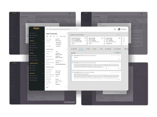
The contact record was a critical feature but plagued with usability issues.
-
Users were frustrated by the inefficiency and high interaction cost.
Objectives:
-
Simplify the user interface to reduce the number of clicks required to access information.
-
Improve consistency with the overall brand aesthetic.
-
Enhance user satisfaction and decrease the volume of user complaints.
"Users reported that the feature was clunky and inefficient, hampering their workflow."
🤿 Diving Into User Research
To tackle these challenges, we embarked on a comprehensive user research journey.
User Research:
-
Conducted initial user interviews to understand firsthand the pain points and needs.
-
Implemented surveys and additional interviews to gather broad quantitative and qualitative data.
-
Performed usability testing on the existing design to identify specific friction points.
"User interviews and surveys revealed key pain points and areas needing improvement."
👩🍳 Perfecting the Experience
To ensure the redesign met user needs, we engaged in focused usability testing.
Testing and Refinement:
-
Engaged with a subset of users who interacted frequently with the contact record feature.
-
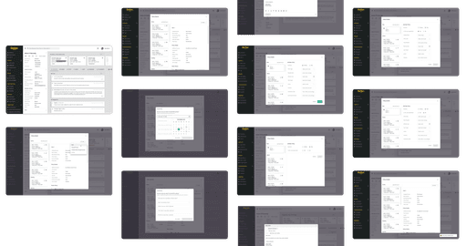
Conducted focused usability testing sessions to refine typography, layout, color, and iconography.
-
Adjusted the information architecture to ensure intuitive navigation and easier access to frequently used features.
"Focused usability testing refined the design to enhance usability and aesthetics."
🚀 Launching the Redesigned Contact Record
After weeks of rigorous design and testing, we launched the redesigned contact record.
Timeline:
-
Week 1: User research and initial mockup design.
-
Week 2: Design and testing of Prototype 1.
-
Week 3: Design and testing of Prototype 2.
-
Week 4: Final adjustments and design freeze of Prototype 3, followed by preparation for deployment.
"The redesigned contact record launched after four weeks of intensive iteration and testing."
🤓 Tangible Improvements and Positive Feedback
The redesigned contact record yielded significant improvements in user satisfaction and efficiency.
Outcome and Impact:
-
User Interface Improvement: The redesign introduced a cleaner, more intuitive layout with streamlined access to essential functions, significantly reducing the average number of clicks per session.
-
Brand Consistency: Updated the visual elements to align with Better Agency’s branding, enhancing the aesthetic appeal and contributing to a more cohesive user experience across the platform.
-
Increased User Satisfaction: Post-launch feedback indicated a marked improvement in user satisfaction, with a reduction in customer complaints by over 50%.
-
Efficiency Gains: Users reported a noticeable decrease in time spent managing contact records, allowing them to focus more on client service and less on navigating the system.


