Shipped Solo: How One Signup Tool Became Three Products
I designed, built, and shipped a scheduling tool for ward secretaries using Claude Code. Then the same foundation shipped twice more.
Executive Summary
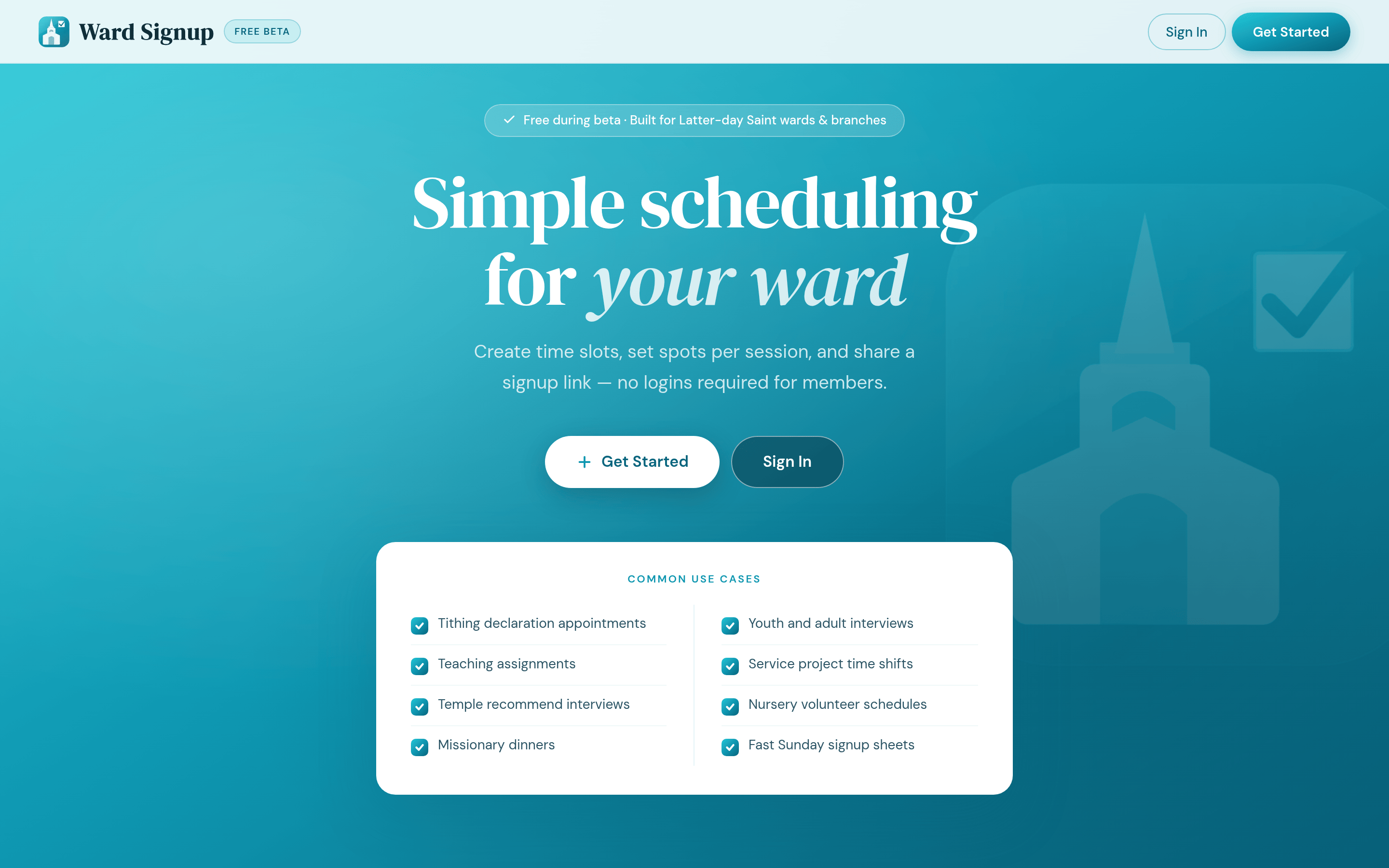
Ward Signup started with something I watched every Sunday: a ward secretary passing around a paper signup sheet, then spending the week chasing people down and deciphering handwriting. Digital tools existed, but they all required accounts, downloads, or training. Dealbreakers when your users range from teenagers to grandparents.
I designed and built the whole product with Claude Code. No mockups, no handoff, no engineering team. A secretary creates an event with time slots in minutes and shares one link. Members sign up by typing their name. No accounts, no app. As easy as the paper sheet, without the chasing.
The Sunday Problem
Background: Ward secretaries coordinate everything from tithing declaration appointments to missionary dinners to service shifts. The default tools are a paper sheet or a chaotic group text. Signups get missed, slots get double-booked, and the secretary becomes a human tracking system.
The catch: Every existing tool added friction that killed adoption. Requiring a login to sign up for a nursery shift is a non-starter. The tool had to be simpler than paper or people would go back to paper.
Designing for the Least Technical User
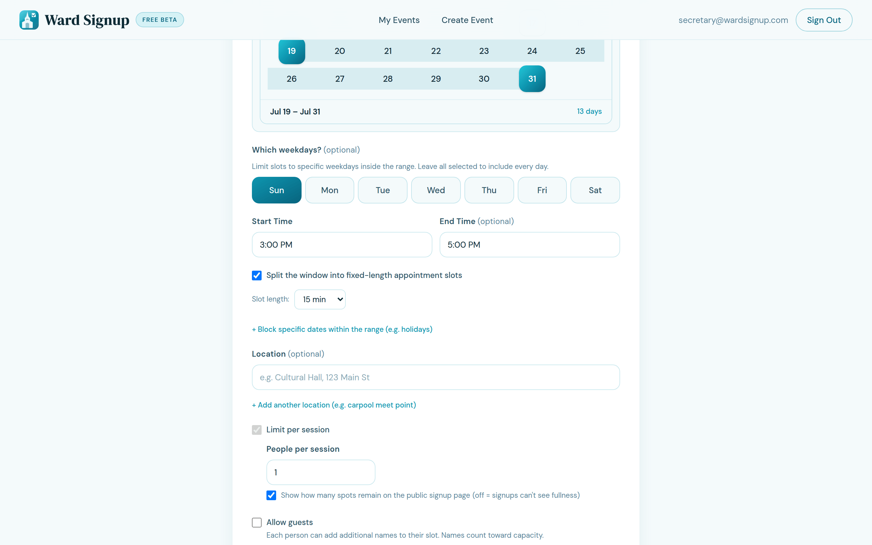
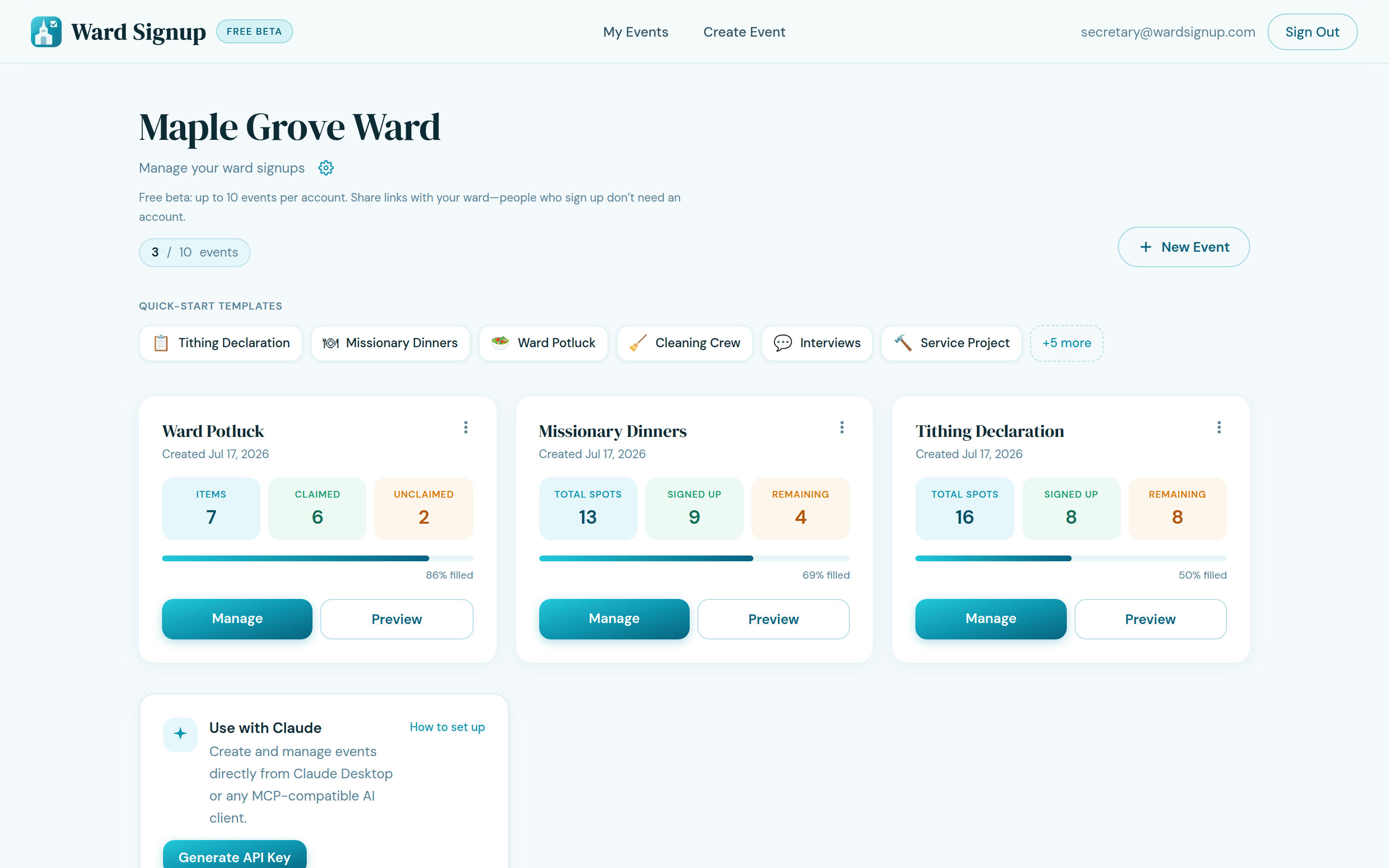
The secretary is the customer. Everyone is the user. Two very different people: the secretary who creates and manages events, and the member who just needs a spot. The secretary gets an account, a dashboard, and tracking. The member gets a link and a name field. All the complexity sits with the person who signed up for it. That asymmetry is the whole product.
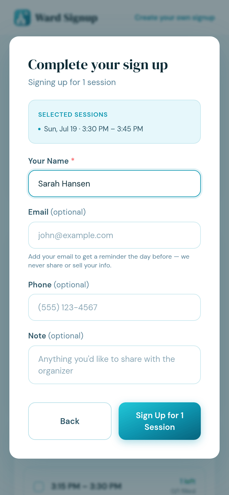
No logins for members, ever. The most important decision I made. Click the link, pick a slot, type your name. Done. This one constraint shaped everything else, and it's why this works where other tools fail.
Spots that manage themselves. Slots close automatically when full. No double-booking, no spreadsheet refreshing. The system does the tracking so a person doesn't have to.
One link, everywhere. Email, text, or printed in the bulletin. Meet people where they are.
Built with Claude Code, Start to Finish
This product never touched Figma. I designed directly in code, building real interactions, testing them live, and iterating on the actual product instead of a picture of it. Design debates got settled by using the thing.
The workflow was fast enough that I took it from idea to production alone. The same foundation now powers ministrysignup.com and orgsignup.com. Same scheduling problem, different organizations. One design decision, three shipped products.
What This Proves
Shipped and live. In production at wardsignup.com, free during beta, handling real scheduling for real wards.
Frictionless by design. If you can type your name, you can sign up. No support burden, no training.
One product became three. The core generalized to ministrysignup.com and orgsignup.com, which proved the design instead of documenting it.
Design-in-code isn't theoretical for me. One person, idea to production, with Claude Code. This is how I work.
Let's Connect 📬
If you want to hear more about this project, let's connect.